
Accessibility, also known as “a11y”, refers to how well a website functions for people with disabilities. Common examples of disabilities in this space include visual conditions like color-blindness, vestibular conditions like animation nausea, and motor disabilities such as cerebral palsy, which happens to be the focus of this article.
The Feature
I am tasked with creating a “jump menu” for navigating tag archives. Something like this:
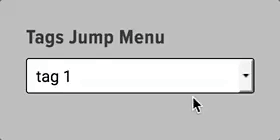
There is no submit button. By merely selecting a menu item, the page navigates to that particular tag archive. The premise of this UI is that, by not having to click a “submit” button, we save the user time and decision-making, hopefully improving the experience.
The Problem
This all works well enough, assuming you’re using a mouse. But what happens if you’re using a keyboard? It turns out that there is no way to exit the menu, without selecting a menu item and navigating the page! This is not acceptable. Per the WebAim docs, a leading source of research on a11y best-practices:
Because these types of menus are activated when the menu item changes, these menus can cause keyboard accessibility issues because you cannot scroll through the list without selecting one of the options.
WebAIM
The Obvious Solution
We could just put a darn submit button on this thing and remove the “jump” behavior. It would be perfectly accessible.
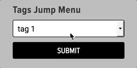
Honestly, this would be my preferred solution, but we want it to match the default WordPress widgets for categories and date archives, which are also jump menus.
The Sneaky Solution
What we can do is add an option to the top of the list with no value, so selecting it does not navigate the page. In this example, I’ll navigate it with a keyboard instead of a mouse:
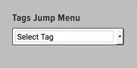
It’s worth noting also that many browsers will honor the “escape” key as a way to exit jump menus.
The Double-Check
At this point, I’m happy. I’m confident that keyboard users can deal with this thing. However, at LexBlog, any time we have an accessibility concern, we run it through the excellent SortSite. It turns out that SortSite is not pleased:

Of the three issues there, the first and third are due to my shoddy jump menu. Fortunately they are the equivalent of a11y typos and are quick to fix via proper HTML, having been through this routine with SortSite many times. Pretty cool: Basically a spell-checker for accessibility.
The End
Ship it! Another ticket bites the dust.
I’m sharing this story because I want people to know that we take accessibility very seriously at LexBlog. Accessible sites tend to be simpler, easier to maintain, faster, and just more intuitive for all users, not just those with disabilities. I also want people to see SortSite, because it’s an example of something we’re always on the look out for, which is automated quality control.
One last thing: The next time you’re curious about accessibility of a website, or you want an empathy practice, try to keyboard your way around. I think you’ll realize pretty quickly why simplicity and accessibility are closely related.